WIRE
Front cover
- The mast head is set out really nicely on the page making it really stand out.
- There is writing across the masthead which is a little unusual; this writing is in black and quite a common font making it really bold and noticeable.
- The lead story is actually going vertically down the page which is very rare and unconventional.
- The rest of the writing on the page is kept to a minimum which works effectively and makes the words that are there stand out more.
- The cost price and barcode in on the bottom right side which is quite common in magazines.
- The lead image is different to most; the man on the front is dressed unusually casual and a bit un-kept.
- There is also quite a lot of whitespace on the cover which again makes it quite different from most music magazines as there are quite busy normally.
Contents
- As with a lot of music magazines the contents has another picture of the front cover on it, this time actually being the main attention grabber.
- The contents is set our different to the previous magazines I have looked at, the number is actually after the title of the article and after the number is the brief explanation as to what the article is about. Finally, the person who wrote the item is as the end.
- Also rather than having separate sections to categorize the things within the magazine, the things that are found on the front cover are in red and a bigger font to emphasise the main stories.
- Just as the front cover there is also a lot of whitespace on the contents pages, which personally I think it makes it look quite boring.
- They also refrain from calling the contents by its proper name and call it “inside” and below this are the name of the magazine and the date, this is quite common within magazines.
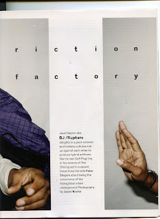
Double Page Spread
- This is mostly taken up by the lead image, which is actually cut and half is on the other page.
- Again the picture its self is of the DJ looking usually casual and extremely un-posed. He is also wearing the same as the picture on the cover which is very uncommon.
- There is again lots of white space making the spread very simplistic.
- The By line and photographer is actually worked into the stand first which is quite rare but is in bold making it more bold.
- The heading is a different font as it is actually quite hard to read due to there being quite large spaces between each letter. However, the black makes it easier to stand out.
- The font of the stand first is extremely typical and common bringing out a little more tradition in a page that is unconventional.


No comments:
Post a Comment